Background
Since the new payment method for public transportation was implemented in NYC, I've heard opinions from bus and subway users about their frustration when they struggle to refill their new OMNY cards.
The Goal
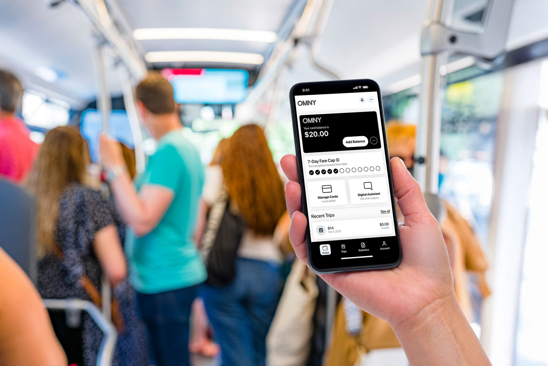
Create a simple and intuitive solution that enhances the user experience when they attempt to reload their new OMNY cards.
Project Type
Mobile Application
My Role
UX/UI Designer
Tools
Figma, Adobe Photoshop, Sticky Notes, sketchbook, pencil
Research & Understand
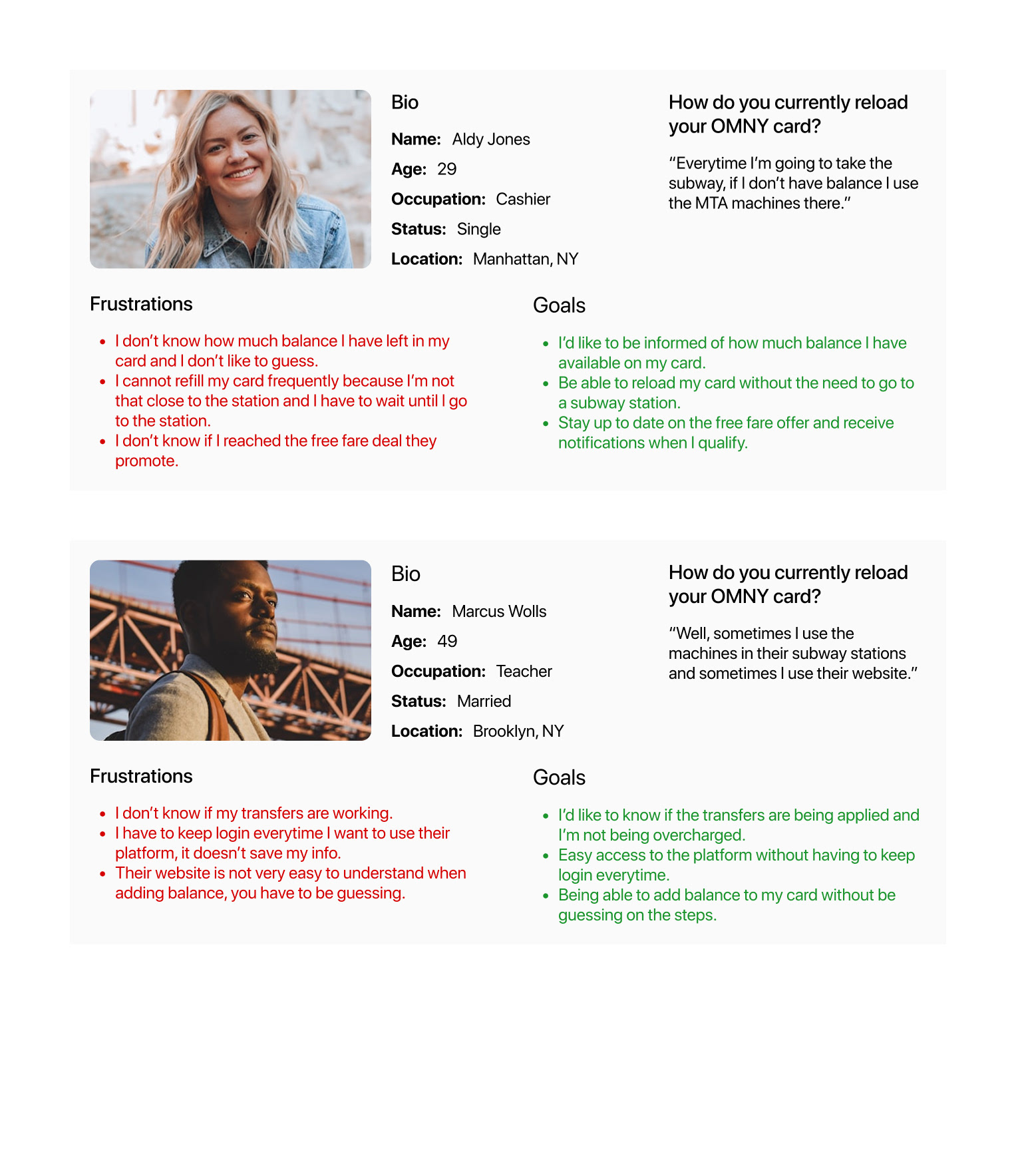
To understand the frustration and pain points of users, I defined the target audience for interviews by creating user personas. These personas helped me gather the necessary feedback to begin shaping the solution. The interviews provided valuable insights into user needs and preferences.
User personas
Interview insights
- "I don't see a way where I can see my balance."
- "I have to go to the train station every time I want to refill my OMNY card. I don't know where else I can do it. It's frustrating. Is that the only place available for that?"
- "I heard that if I use my card more than 12 times in a week, the additional rides will be free, but how do I know if I qualify for that?"
- "Why does OMNY not have a mobile app? It would be easier to manage my OMNY card myself."
- "I don't know if the transfers are working well. When I use the card on the bus, it doesn't say "TRANSFER OK" like the old MTA cards."
- "They have a website where you can "manage" your card, but it's not very intuitive, I mean, I took me so much time until I figured out how to add value to my card."
Pain Points and Goals
Understanding users' pain points through their journey and their desired goals.
Pain Points
- I can't see the balance on my card
- I feel limited to refill my card only in the subway station.
- I can't see my progress to qualify for free rides.
- I don't know if the transfers are being applied.
- I can't see my travel history and how many times I've used the card.
Goals
- I manage the balance of my card myself from anywhere.
- I can see if transfers are being applied correctly and how many I've been taken.
- I can see if I qualify for free rides.
- I can see the history of my card.
- I can receive notifications of important messages (Low balance, free rides, etc).
Hypothesis
After analyzing interview insights, users' pain points, and goals:
A mobile application could be a good solution for this problem because of the following reasons:
- It can provide easy access, and users can use it anytime, anywhere to reload their card balance, therefore, u
- It can keep users informed about any important information regarding their balance, offers, and reminders.
- User will be able to track their balance usage, charges, and transfers.
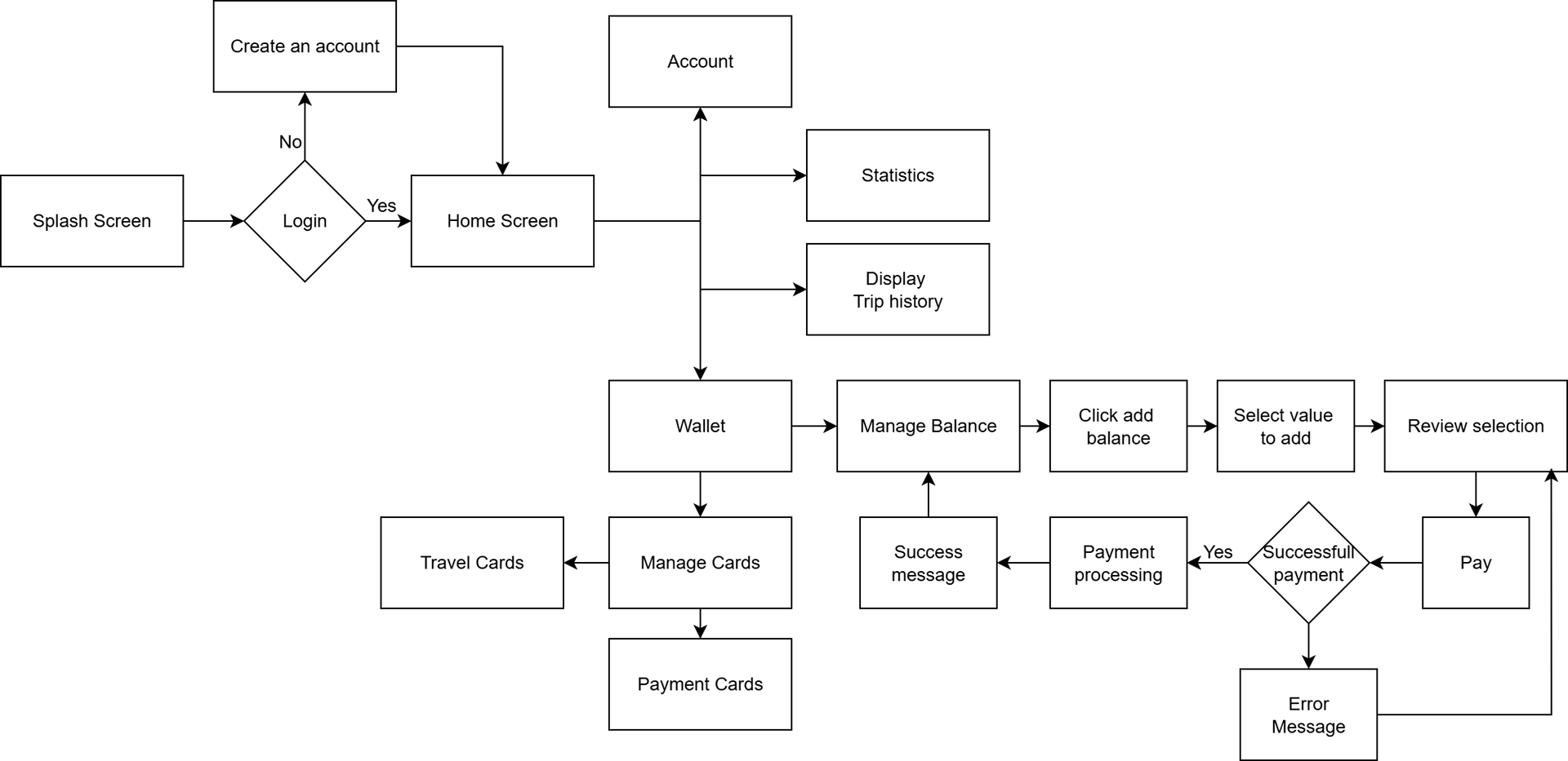
User flow
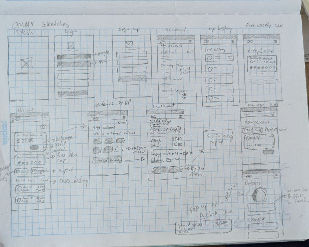
Sketches
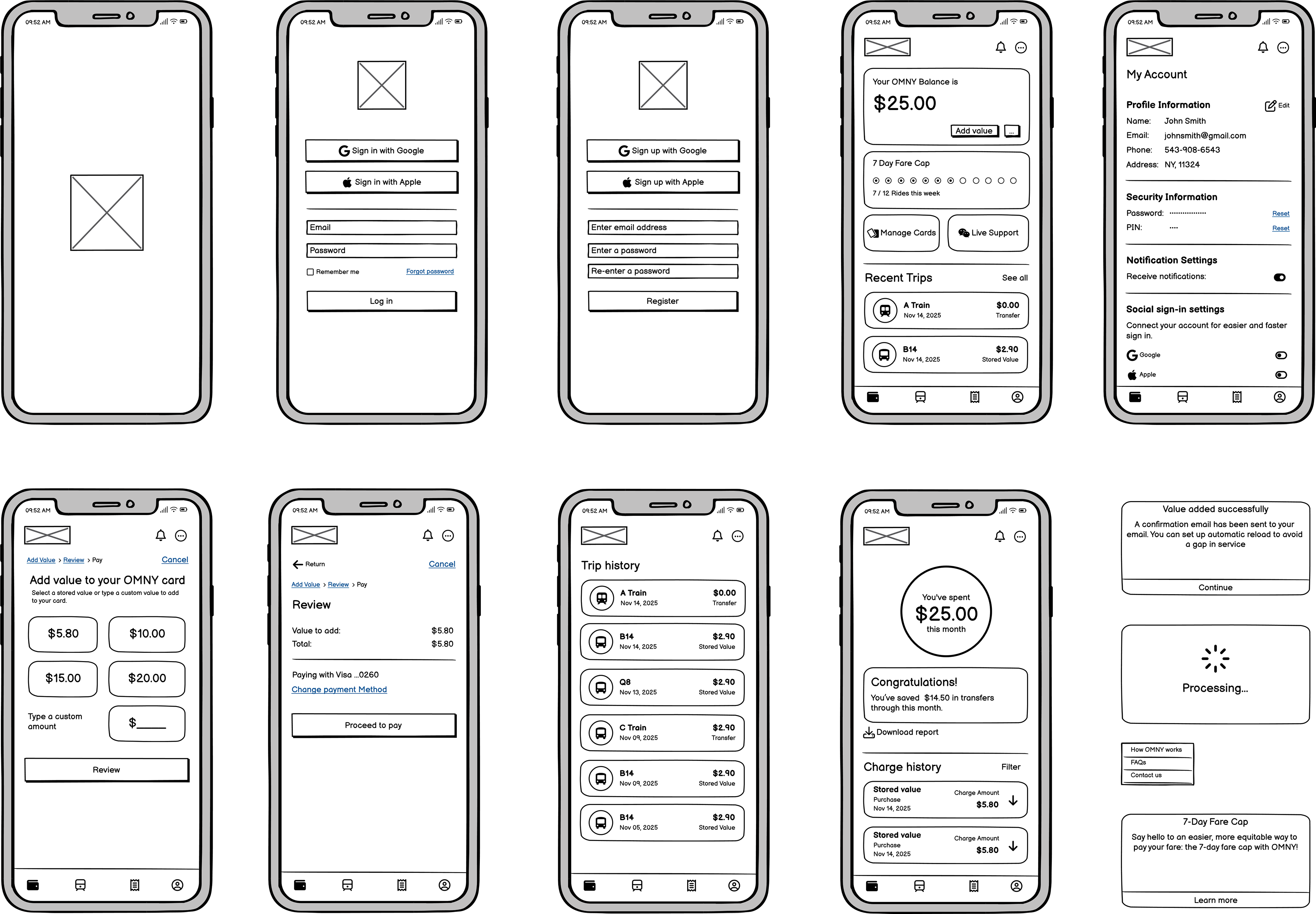
Low Fidelity Wireframes
Design System
Using atomic design, I established a scalable design system to create a consistent and efficient user experience platform-wide. This included a unified visual language and a comprehensive, adaptable component library, simplifying design and ensuring long-term consistency.
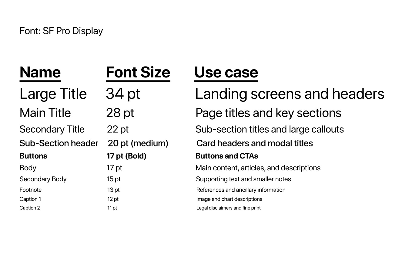
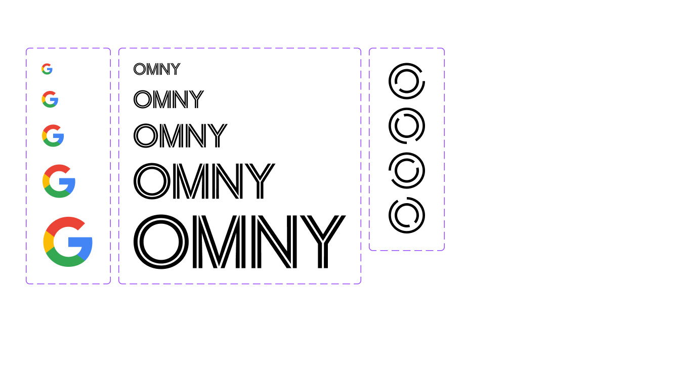
Typography
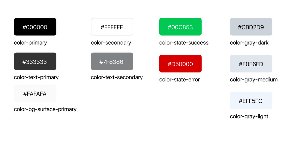
Colors
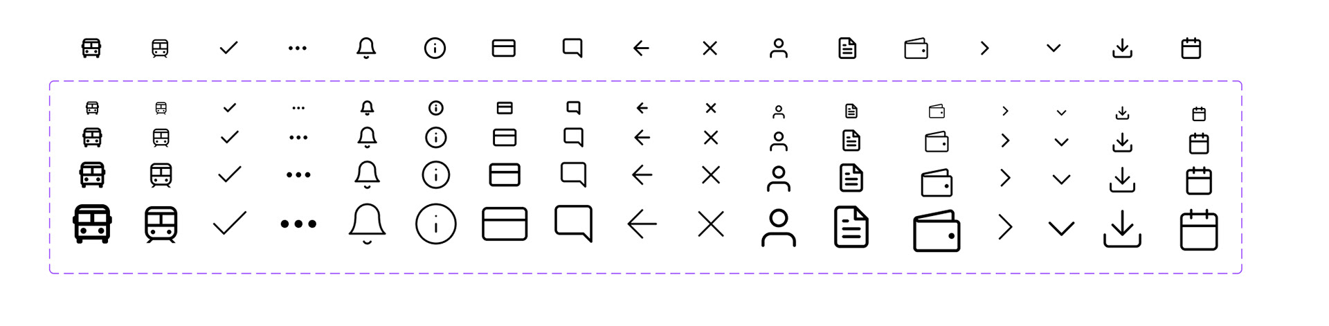
Icons
Logos
Atoms
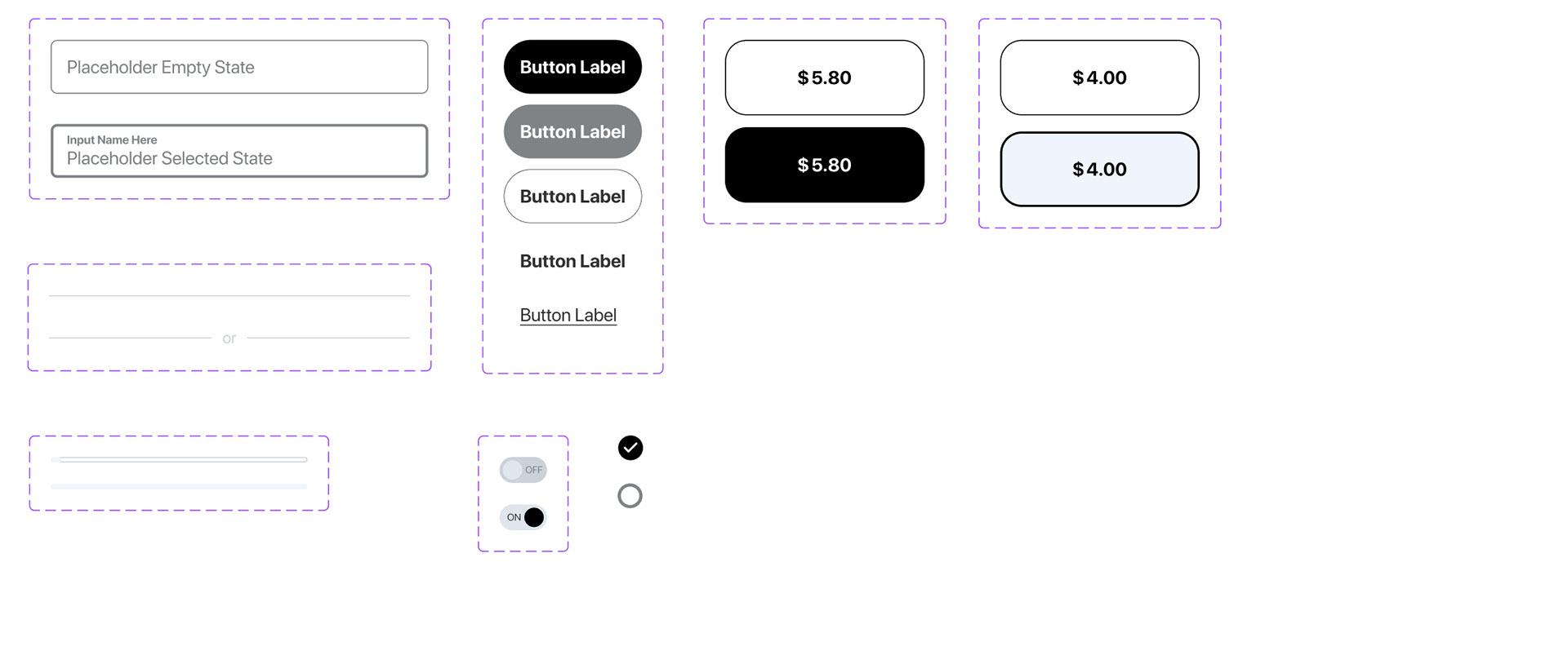
Molecules
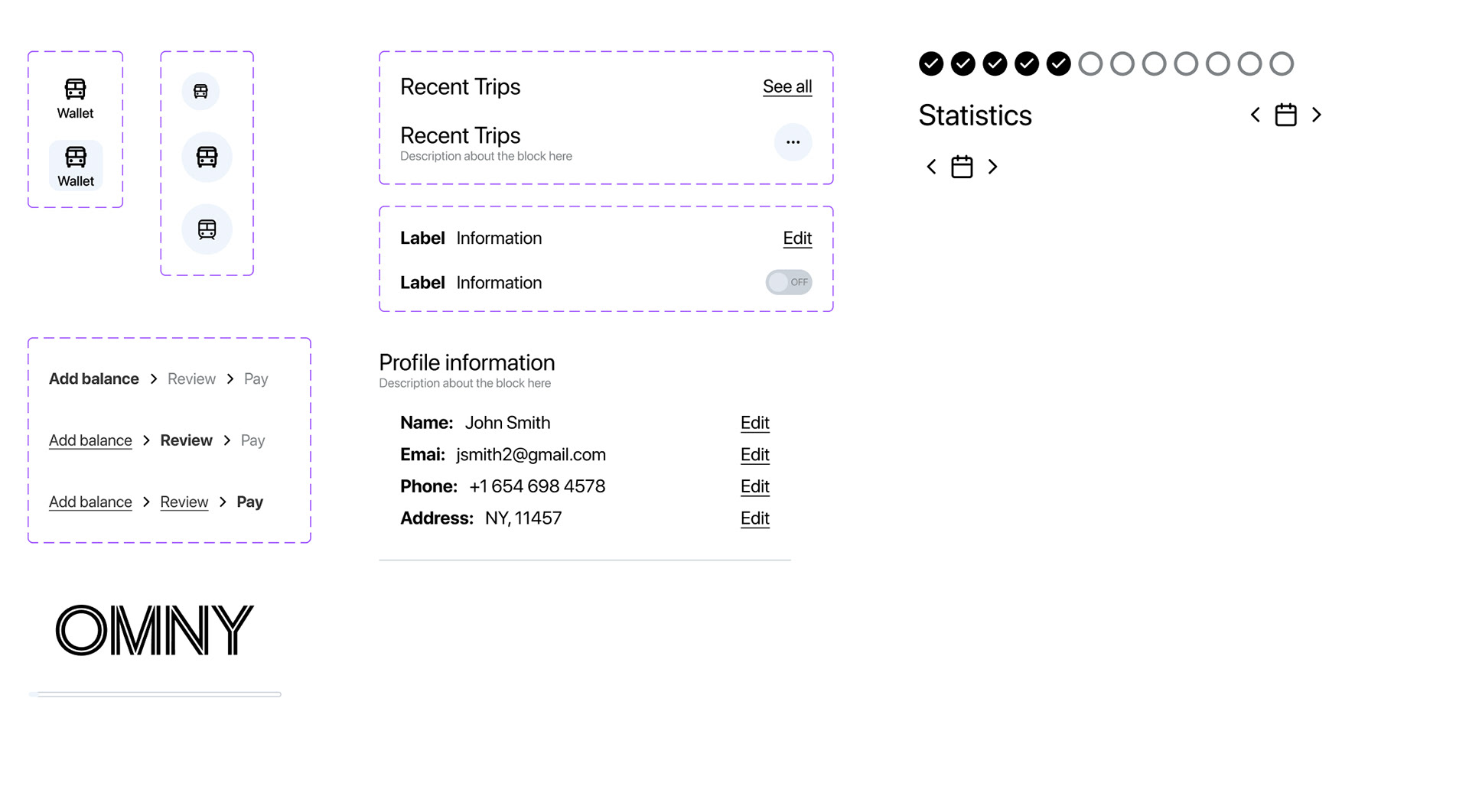
Organisms
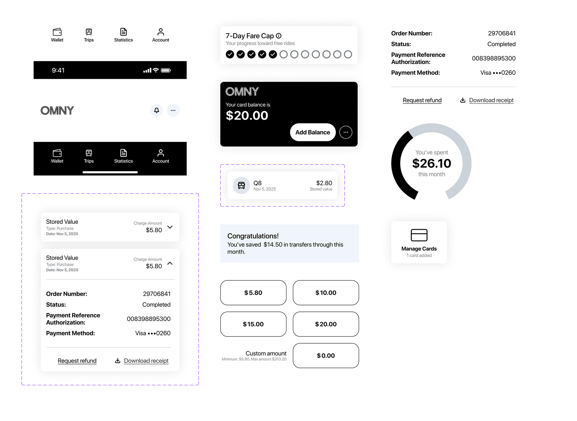
Patterns
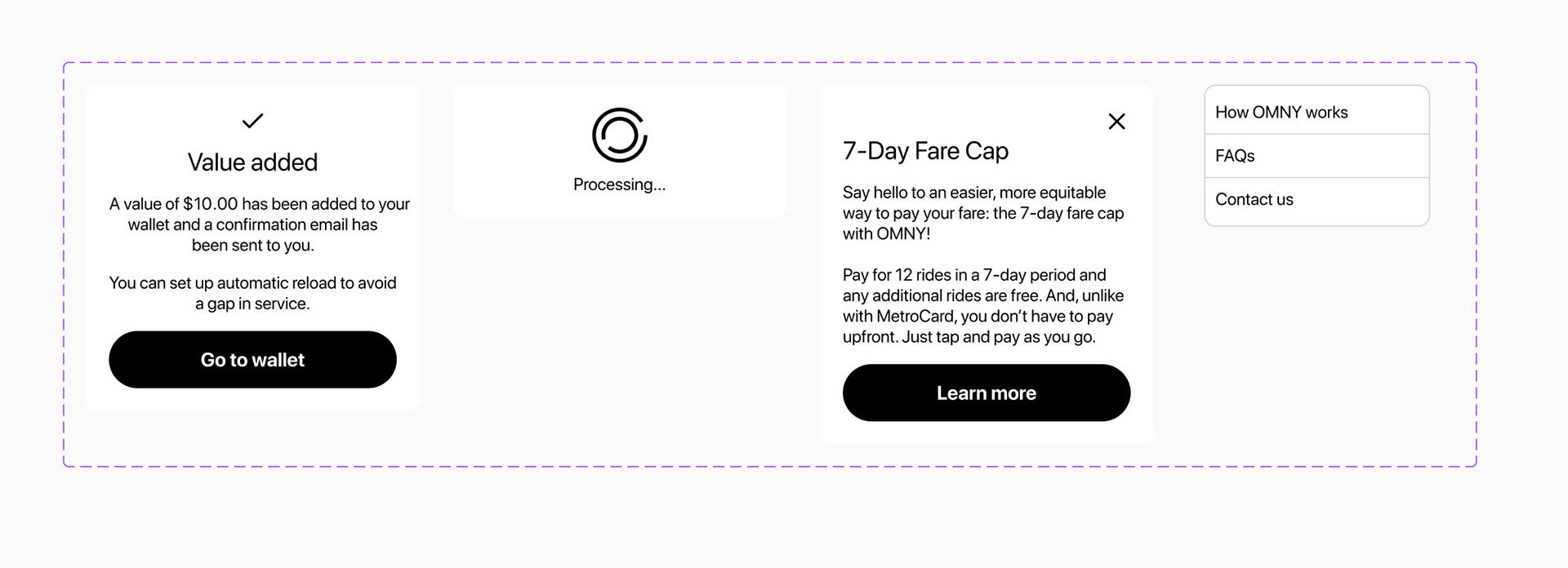
Overlays
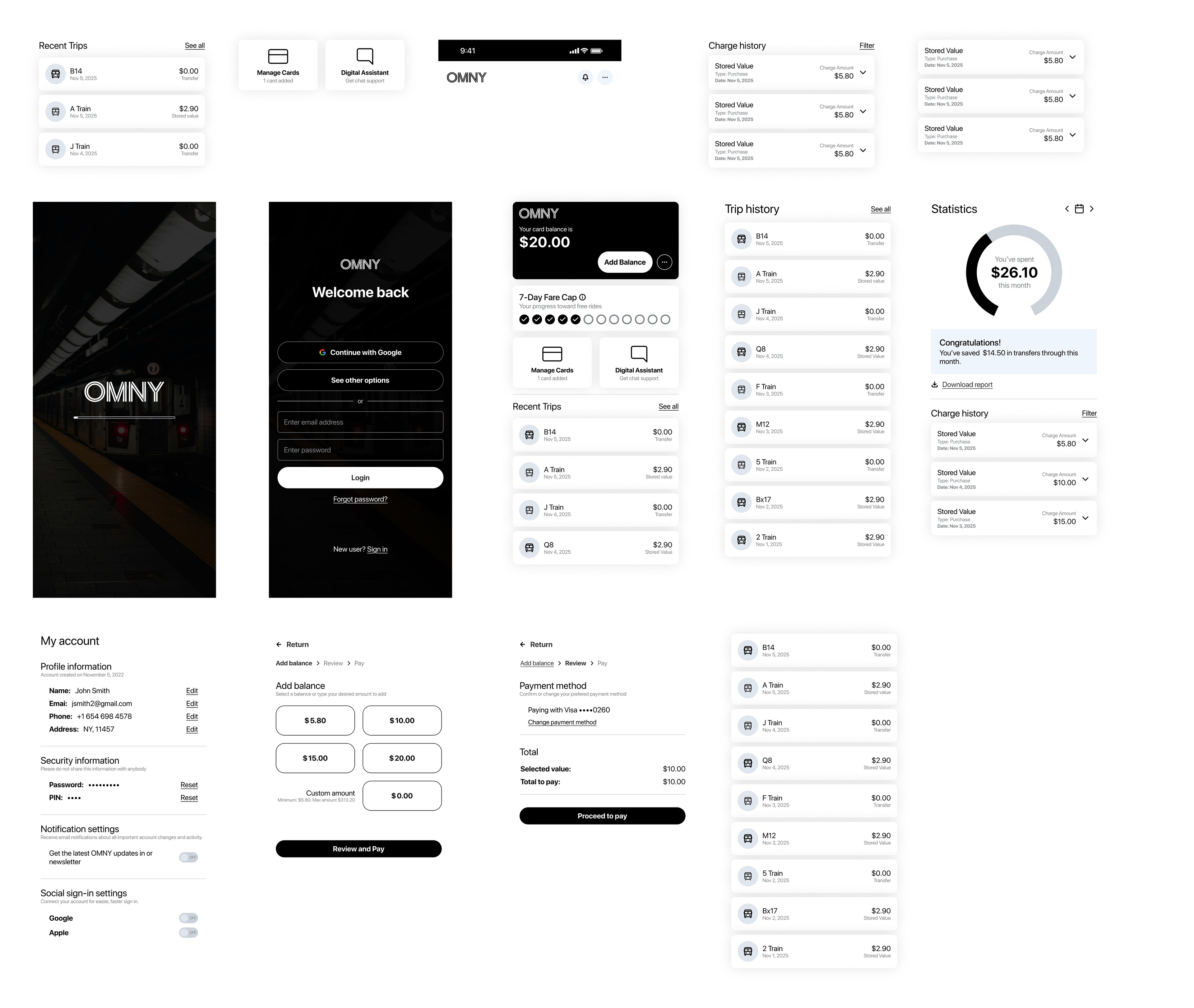
User interface
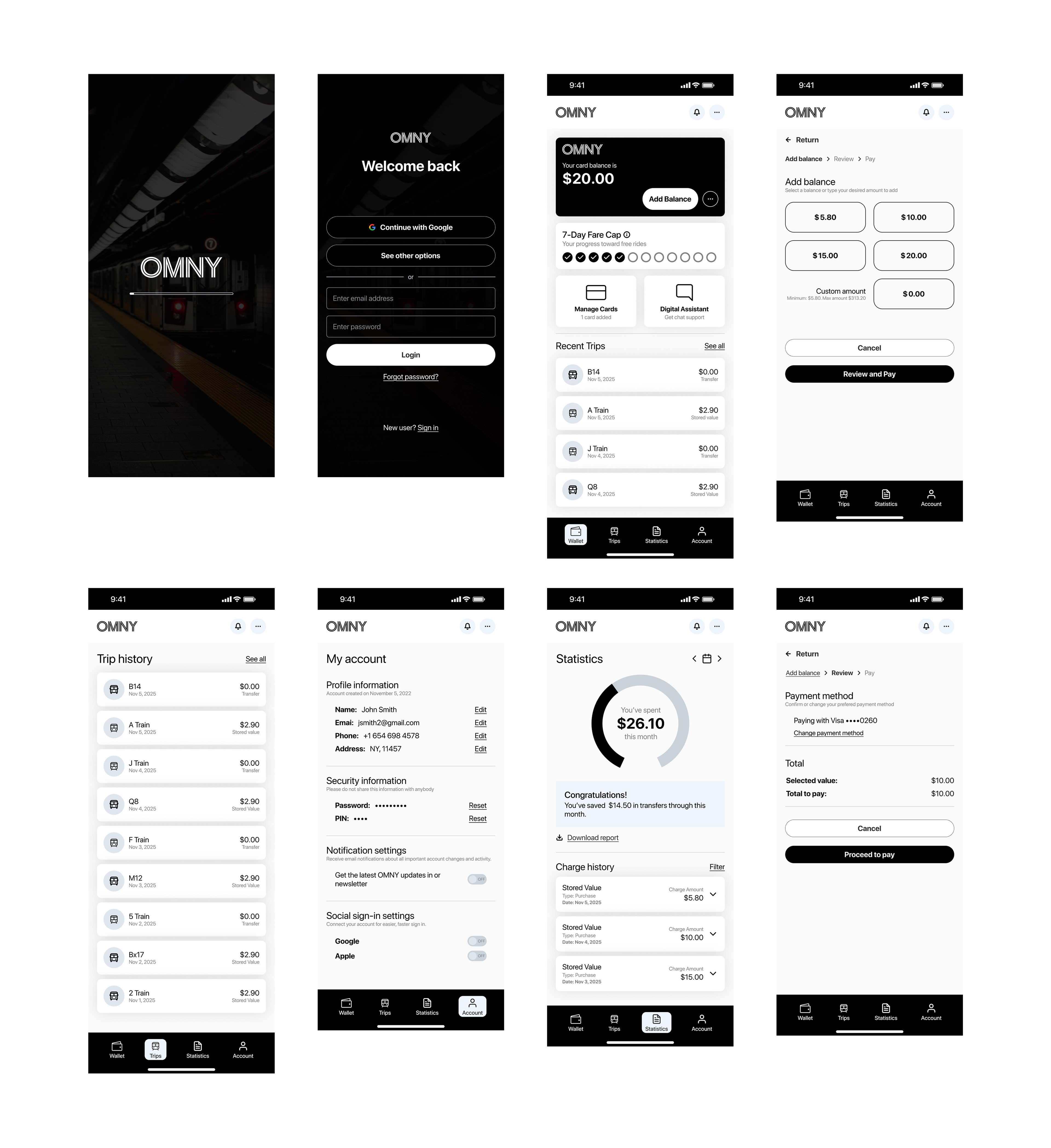
Digital prototype
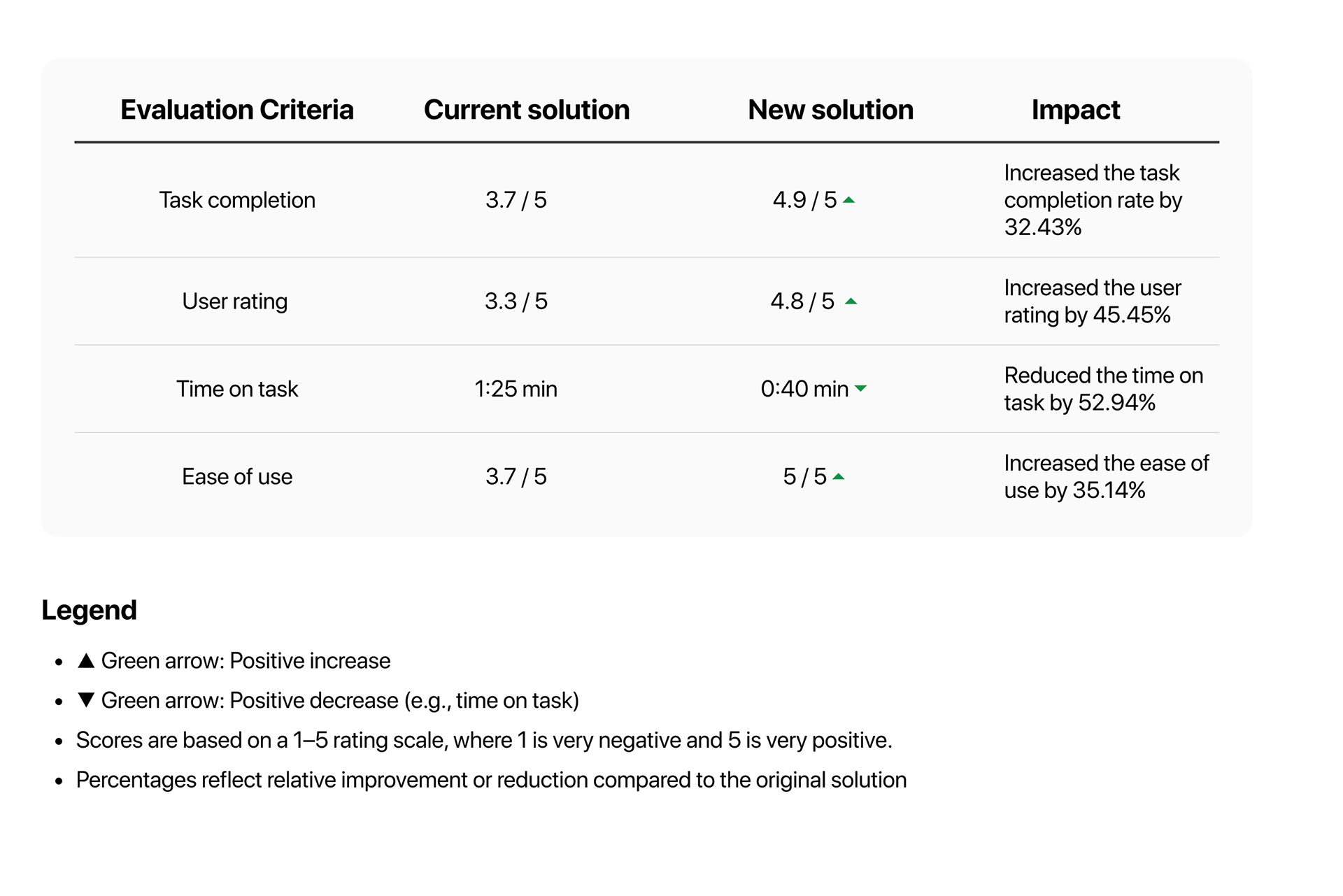
Impact and results
I evaluated the success of the design solution by conducting usability testing to assess the new solution's effectiveness. I asked 5 users to complete a "reload balance" flow using the prototype, where each user had to add value to their card's current balance. The results, based on the evaluation criteria, and the impact of the new design are below.