1- Research & Understand
To understand the frustration and pain points of users, I defined the target audience for interviews by creating user personas. These personas helped me gather the necessary feedback to begin shaping the solution. The interviews provided valuable insights into user needs and preferences.
User personas
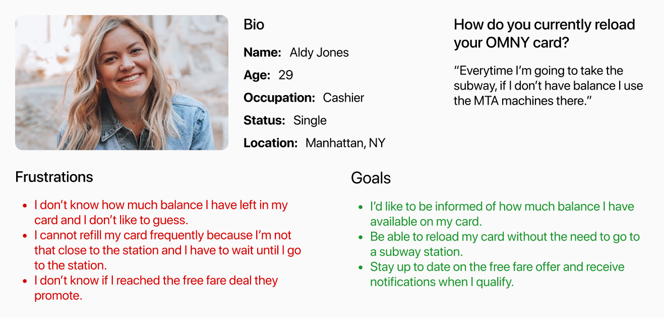
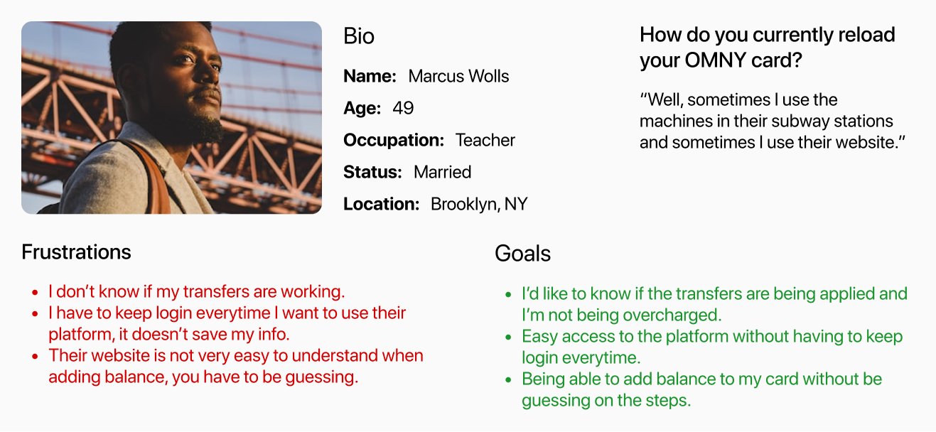
Interview insights
Pain Points
- I can’t see the balance on my card
- I feel limited to refill my card only in the subway station.
- I can’t see my progress to qualify for free rides.
- I don’t know if the transfers are being applied.
- I can’t see my travel history and how many times I’ve used the card.
Goals
- I manage the balance of my card myself from anywhere.
- I can see if transfers are being applied correctly and how many I’ve been taken.
- I can see if I qualify for free rides.
- I can see the history of my card.
- I can receive notifications of important messages (Low balance, free rides, etc).
Hypothesis
After analyzing interview insights, users’ pain points, and goals:
A mobile application could be a good solution for this problem because of the following reasons:
- It can provide easy access, and users can use it anytime, anywhere to reload their card balance.
- It can keep users informed about any important information regarding their balance, offers, and reminders.
- User will be able to track their balance usage, charges, and transfers.
2- Ideation
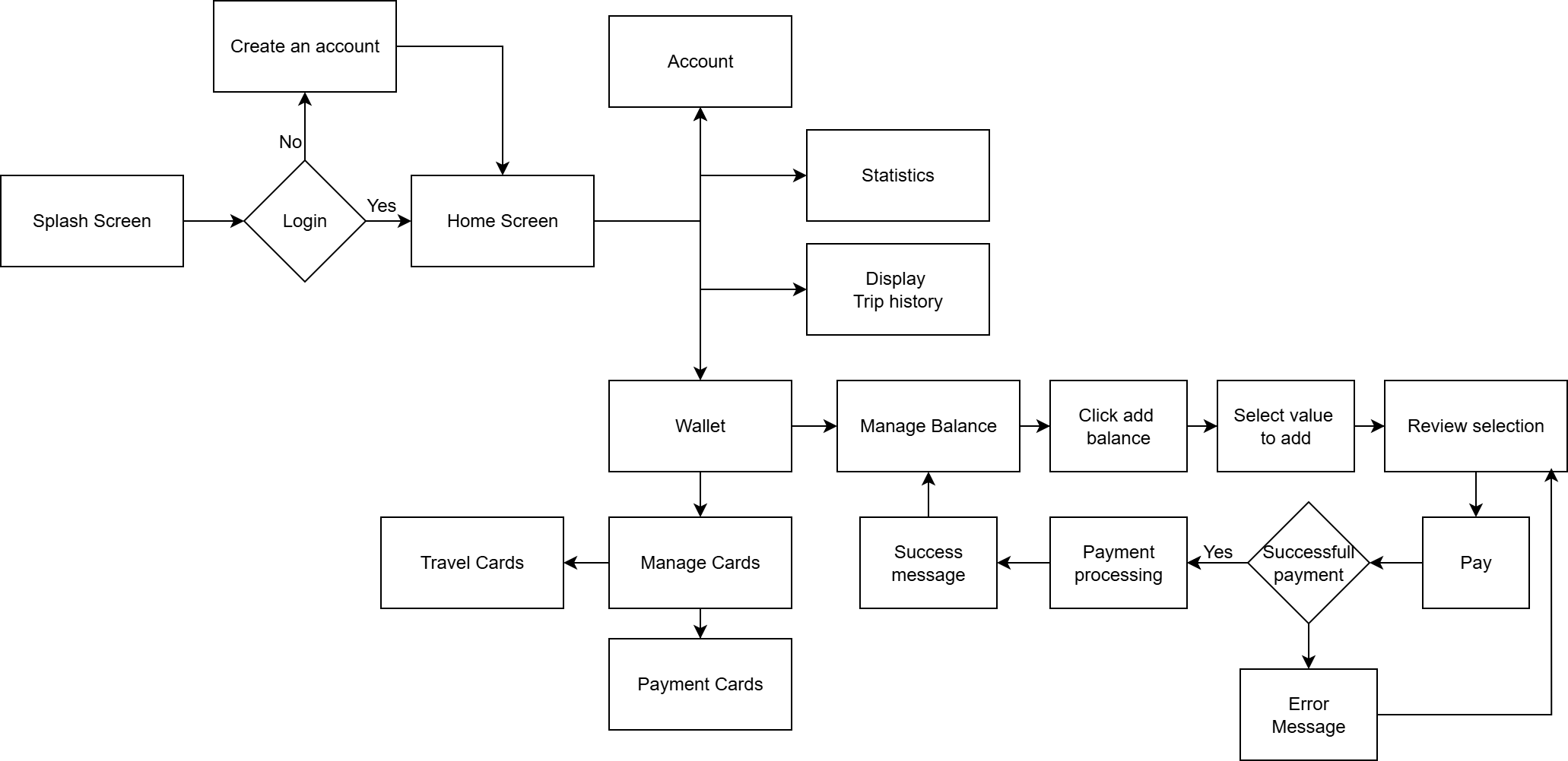
User flow
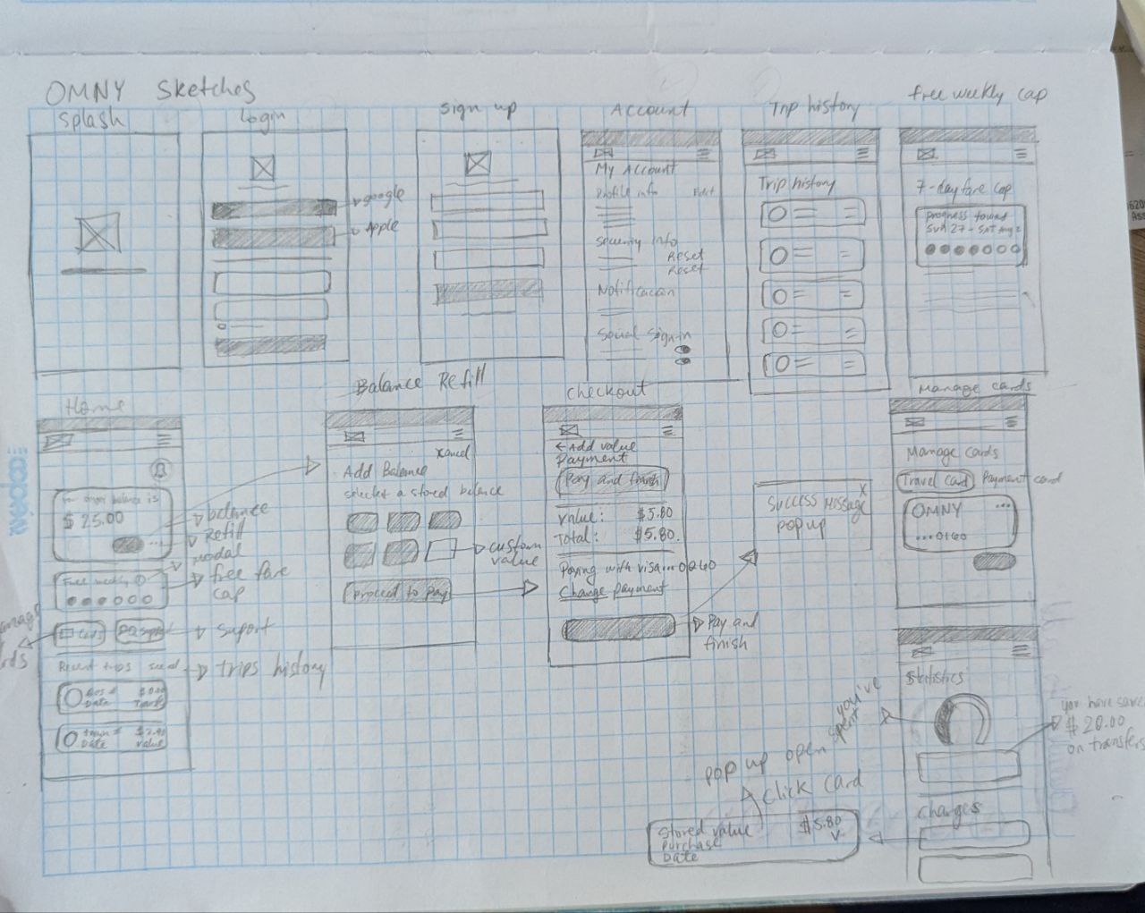
Sketches
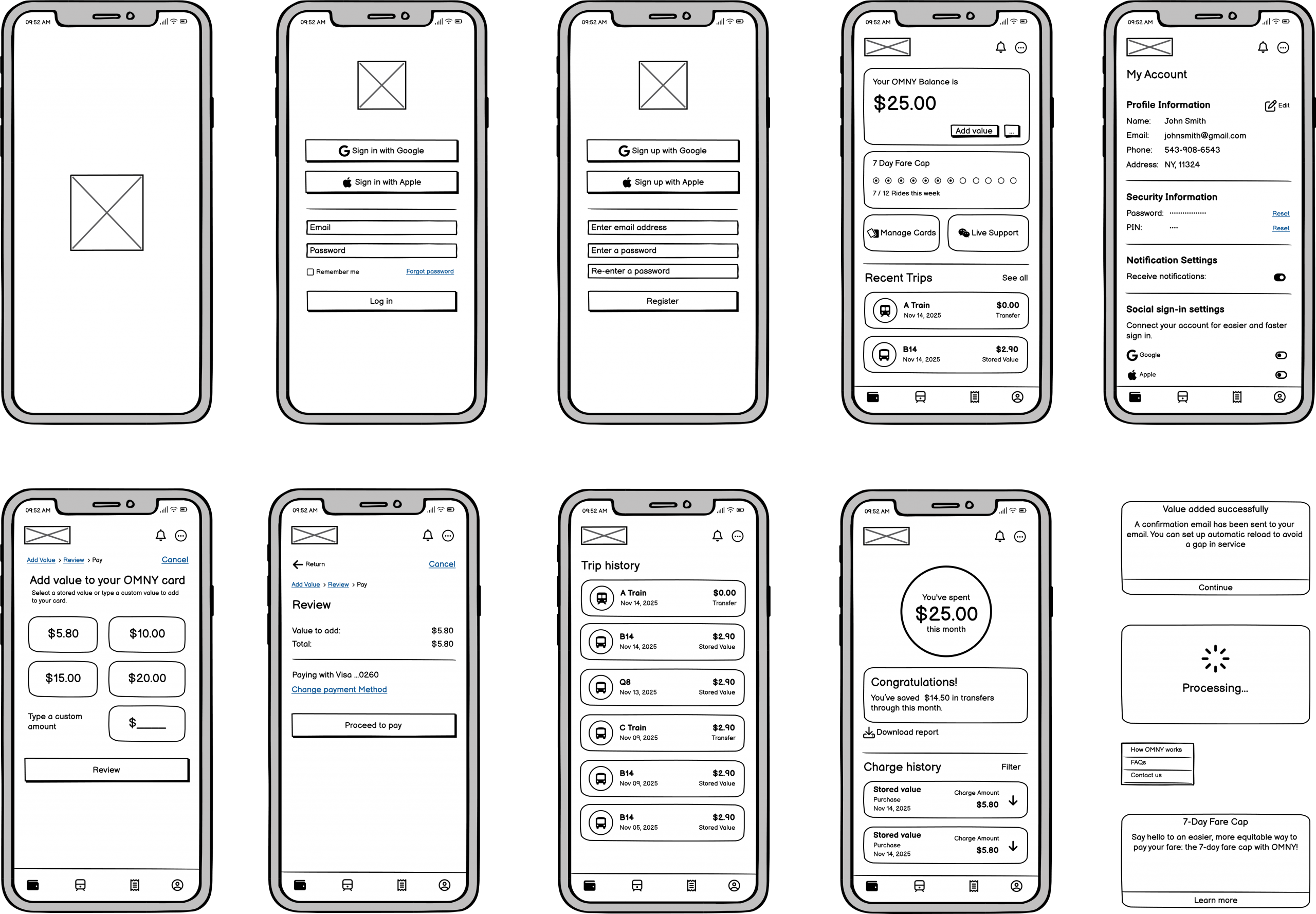
Wireframes
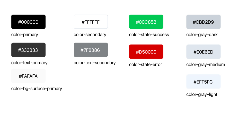
3- Design System
Using atomic design, I established a scalable design system to create a consistent and efficient user experience platform-wide. This included a unified visual language and a comprehensive, adaptable component library, simplifying design and ensuring long-term consistency.
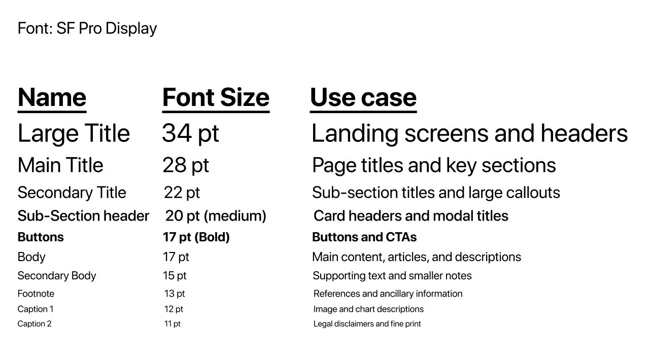
Typography
Colors
Icons
Atoms
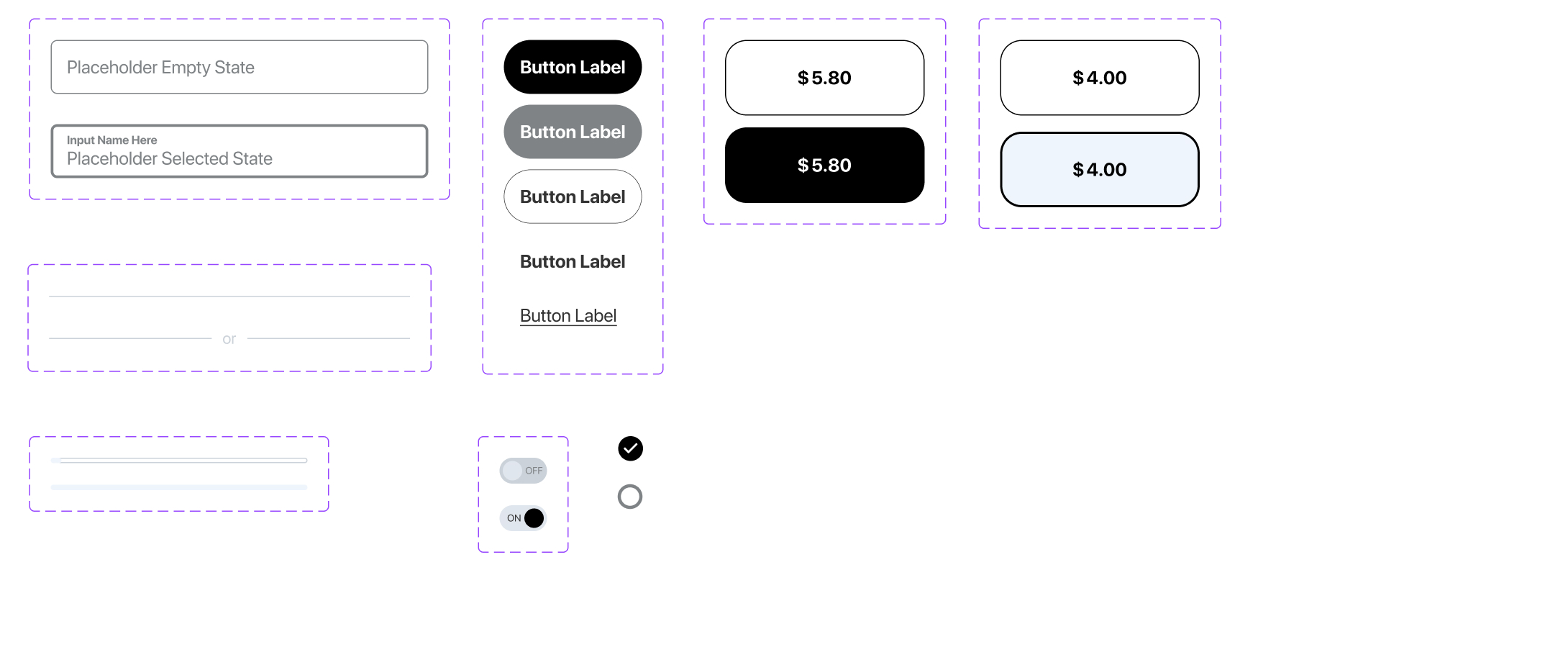
Molecules
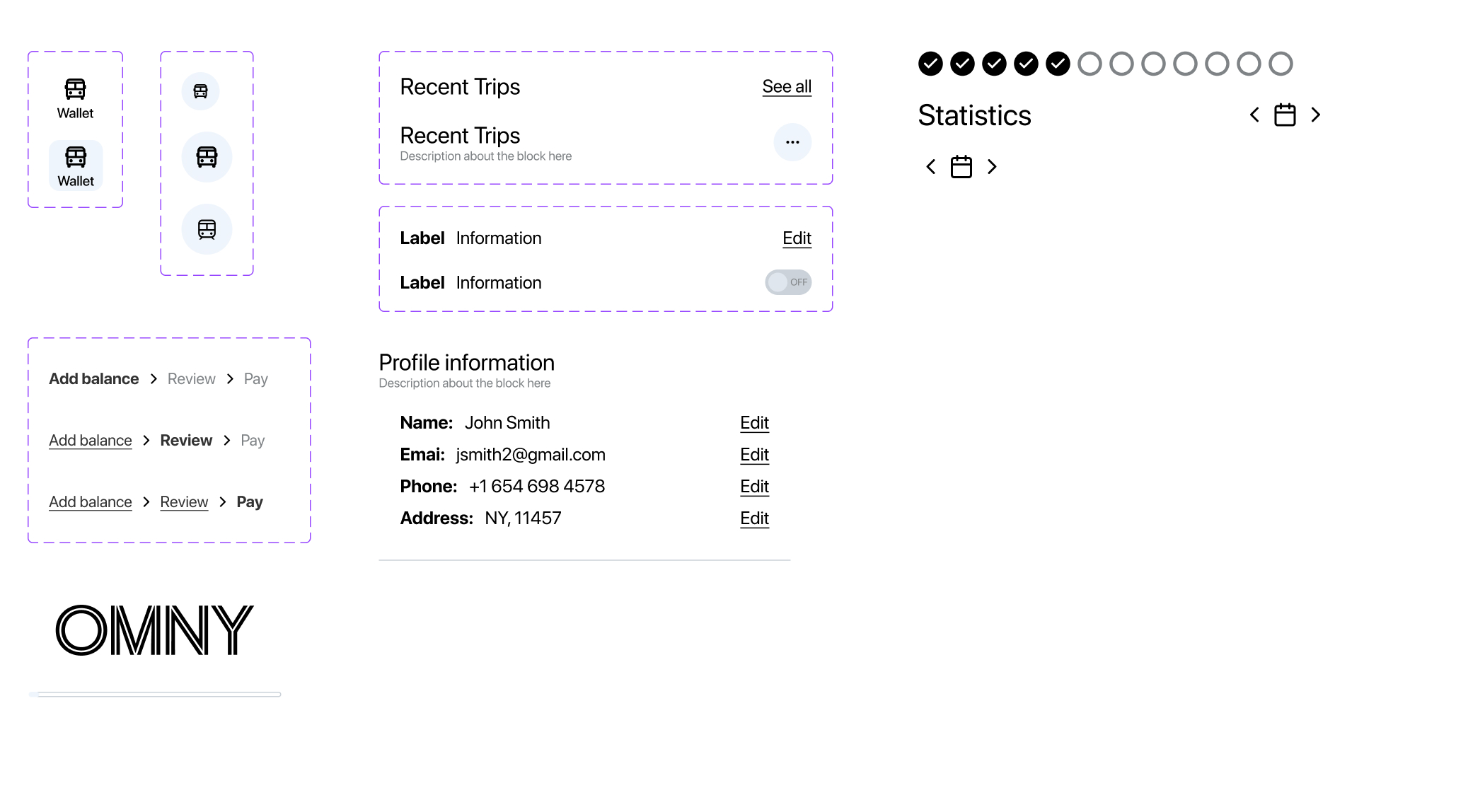
Organisms
Patterns
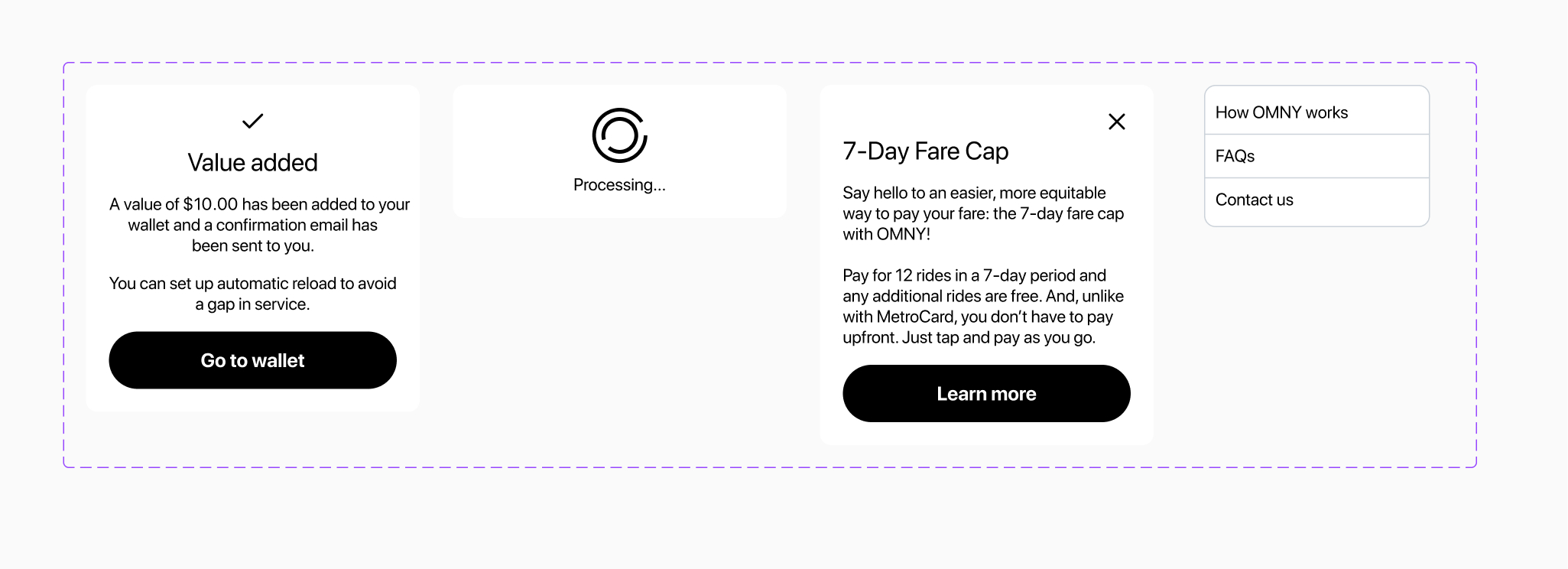
Overlays
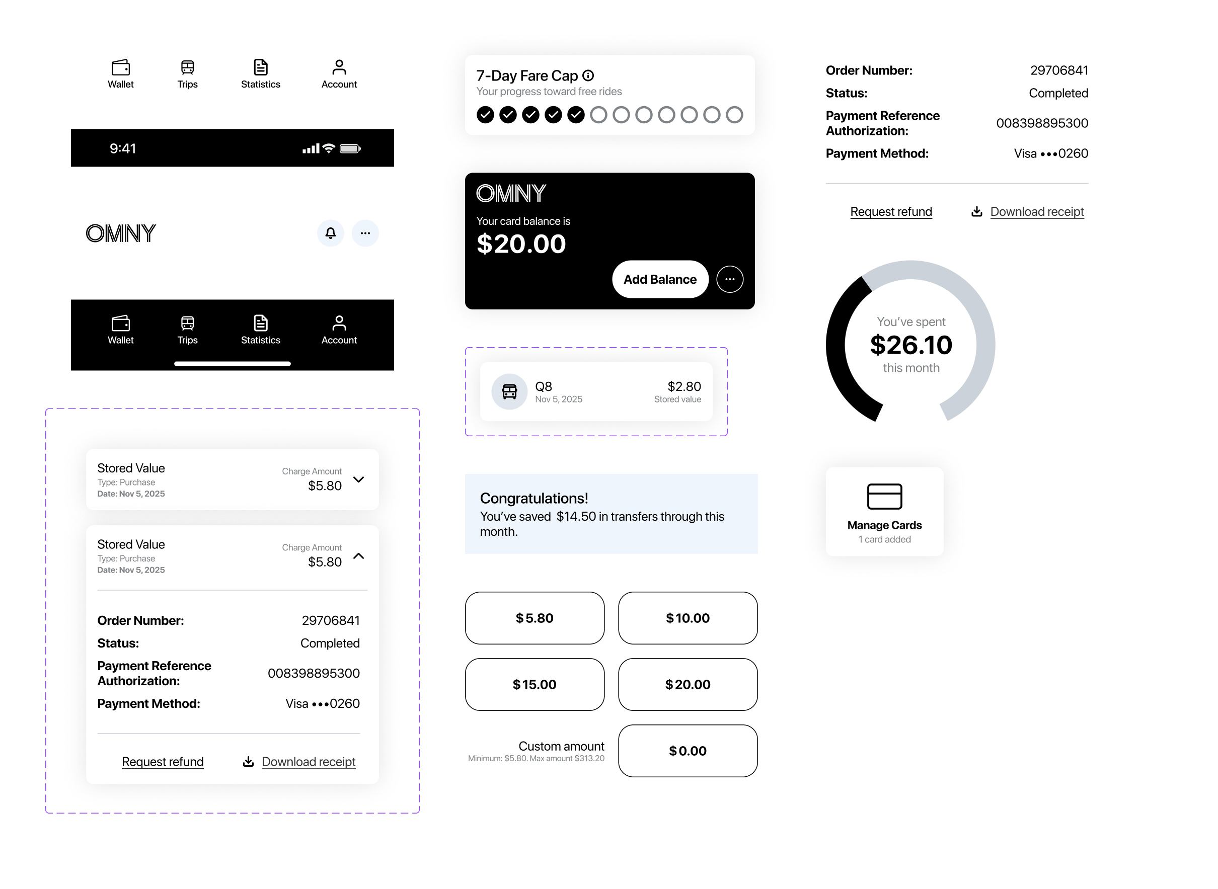
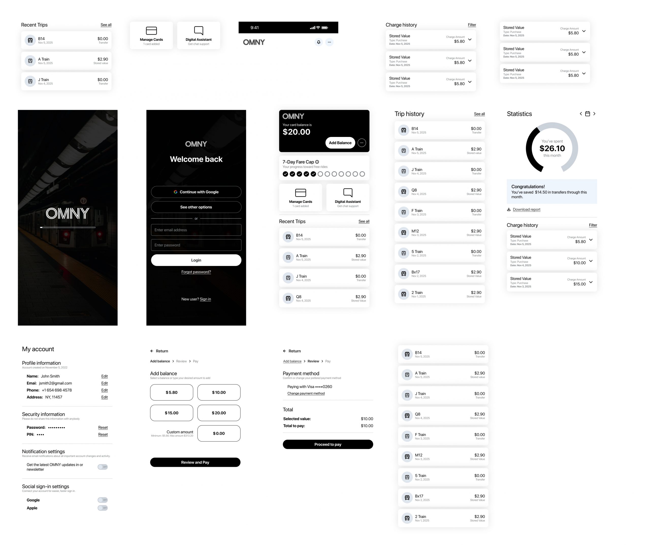
User interface
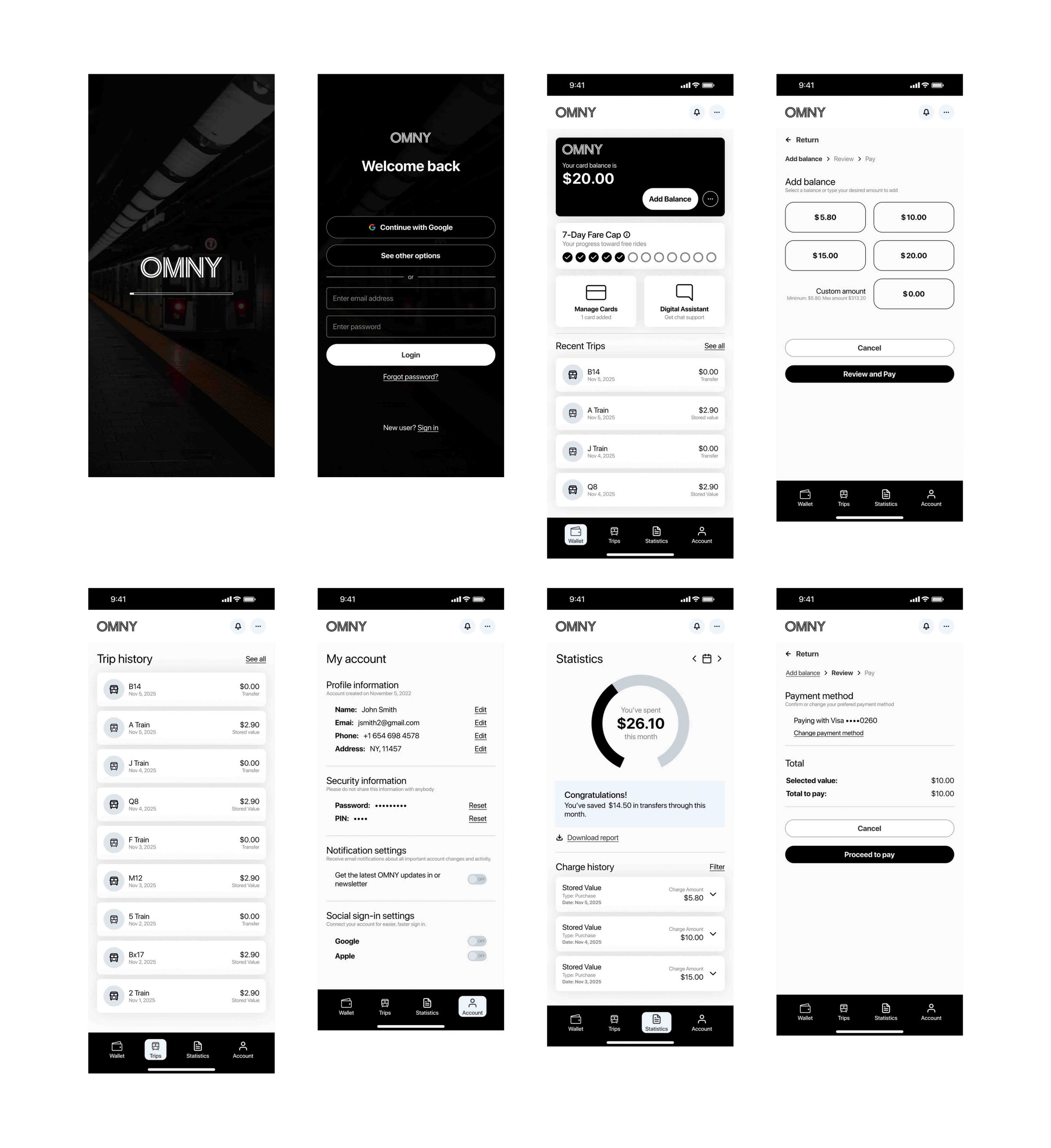
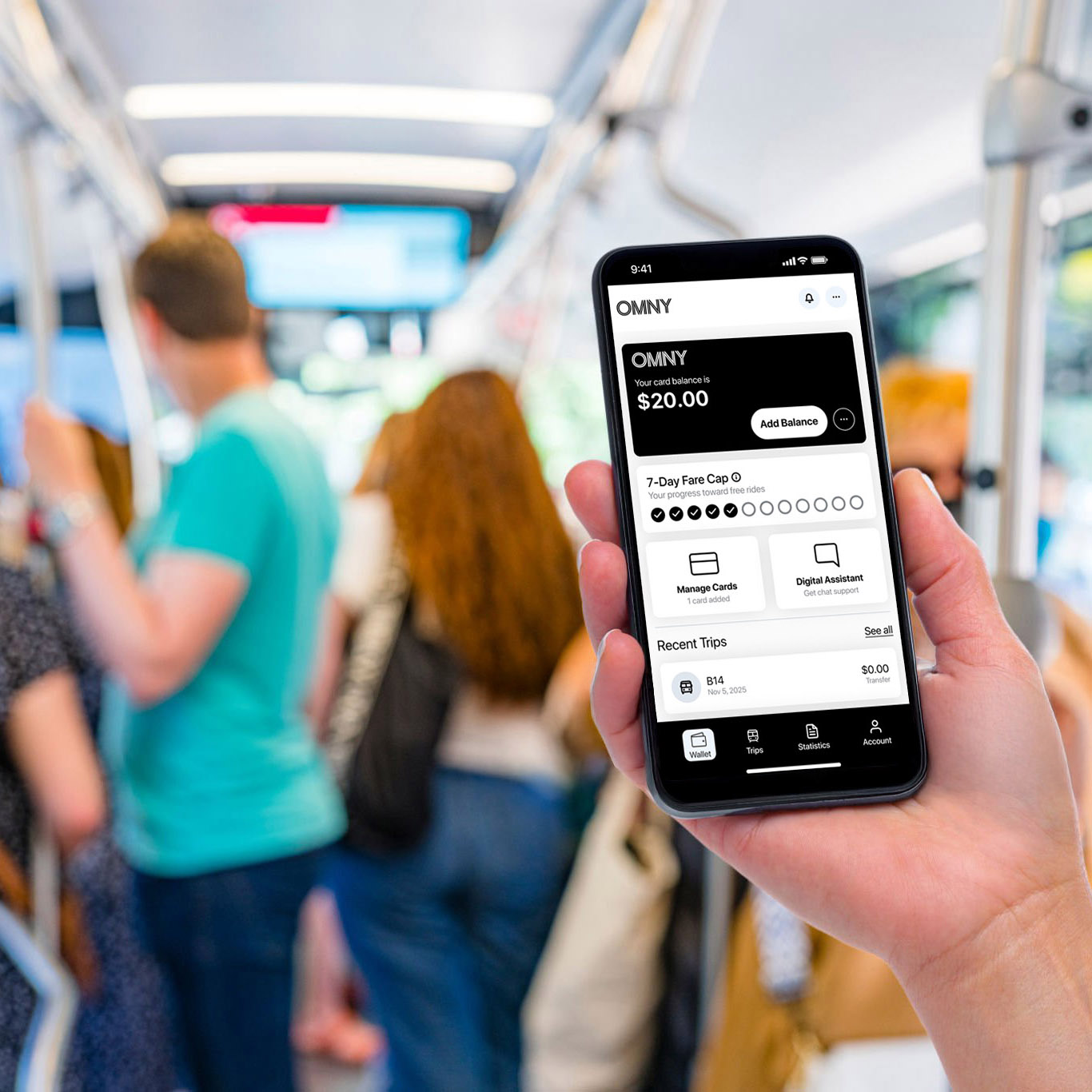
4- Digital prototype
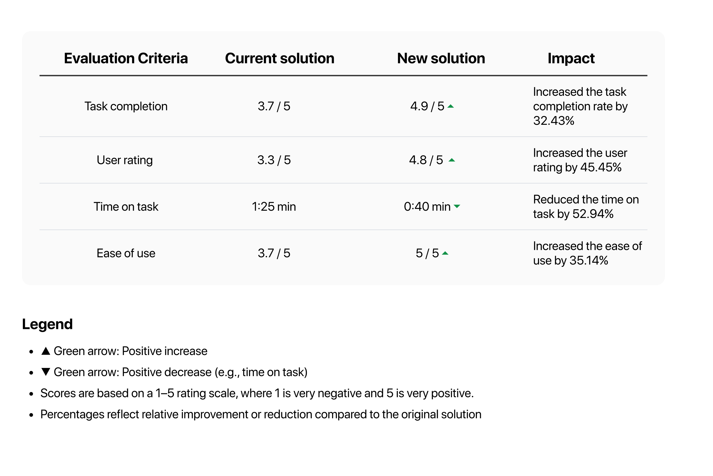
5- Impact and results
I evaluated the success of the design solution by conducting usability testing to assess the new solution’s effectiveness. I asked 5 users to complete a “reload balance” flow using the prototype, where each user had to add value to their card’s current balance. The results, based on the evaluation criteria, and the impact of the new design are below.